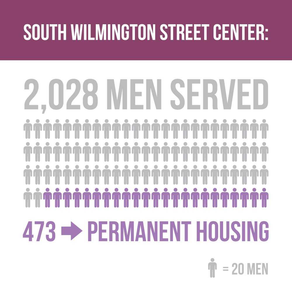
Graphic created by Wake County staff and is consistent with their efforts to communicate simply with their public.
Our understanding of government is shaped by how frequently we interact with it and how much we understand its role in society. This time of year, we’re keenly aware of what we pay in taxes but don’t always think about other government interactions. There’s a good chance public sector employees collect your trash and recycling; the street you took to work today is owned and operated by a government department; and in many places public employees recruit new jobs to the community.
“Government work is often complex and complicated,” said Dara Demi, Communications Director for Wake County, NC. “The point we’re trying to get across must be easy to understand, free of technical jargon and resonate with the target audience.”
Demi and other professional communicators work hard to make government easier to understand. She directs communication efforts for Wake County, the most populous county in the fast-growing Research Triangle metropolitan area in North Carolina. Her audience of more than a million people includes natives as well as lots of recent newcomers. When her team prepares a new message or campaign, they ask three questions before moving forward:
-
Is the message clear?
-
Is the message concise?
-
Is the message valuable?
“We have to become instant experts on topics like well water testing, communicable disease response or budget development – areas that we certainly didn’t study in college,” Demi said. “But, that outsider perspective is what enables us to cut through the technical talk and create clear, concise messages to share with our residents and the media.”
Effective communication between government and the people it serves is always important, but perhaps even more important right now. According to Pew Research, Americans’ trust in the federal government has dropped steadily over the past 60 years or so. Trust has been at its highest during times of adversity; the figure was close to 80% after the Kennedy assassination and close to 60% after the 9/11 terrorist attacks. It has dropped steadily since then. Today, fewer than one in five Americans (about 18%) say they trust the federal government to consistently do the right thing.
The numbers run quite a bit higher for state and local government. According to a 2016 Gallup poll, about 71% of Americans say they have a “fair” or “great deal” of trust in their local government (cities and counties), and about 62% gave the same marks for state government. Both democrats and republicans express similar sentiments about local and state governments.
Local and state government are most likely to touch people directly, whether it’s through zoning, economic development, or infrastructure such as water, sewer, and streets, so communicating clearly is especially important. Demi’s team uses the traditional routes (news media, website, etc.) but they also emphasize visual communication through video, photography, and infographics. For many people, visual platforms boost understanding significantly.
“News releases are still a great way to share a message. But, they’re definitely not the only tool [public relations] pros should have in their toolbox,” Demi said. “On social media and the web, users don’t want to read long blocks of text. They want quick nuggets of information that are instantly consumable and shareable. That’s why graphics are so wildly successful on these platforms. Not only do they stand out visually in sea of text, but they often explain the message in a much simpler way than words ever could.
Figure one is a good example; it shows very simply the numbers of people the County served at its shelter for homeless men and contrasts that with the number who found permanent housing. For many residents, visual representations of the numbers is easier to understand than the numbers alone.
Wake County’s website includes a series of infographics about its current budget (the 2019 proposal will be posted soon). Once the new proposed budget is released each winter, the public can weigh in before officials vote on it during the summer. Numbers can be difficult to understand, and infographics provide some much needed context.
In many cases, the communication team must learn from topical experts before coming up with the best tools to communicate.
“We can’t make it easier for others to understand if we don’t understand it ourselves,” Demi said.
As a resident, you may have access to similar graphics, videos, or other visual content in your area. Depending on where you live, you may be served by city, county, and state workers. Websites are a good place to start; they provide an archive of useful information, though some local government sites can be difficult to navigate. Because budget proposals are so complex and because transparency is important, you may want to search for budget graphics first.
We’re interested to hear about effective tools your local government uses to engage with the community. Do you feel connected? If so, how was that relationship established? We’d love to hear your comments in the reply section below.